
Mike Madrid Interview Part 2: Creating The Banana Republic Catalog Before The Digital Age
When I started, the process was a little piecemeal. The illustrators weren’t given that much direction, and we would have to try to make the pages work with what we got from them. Also, the merchandisers weren’t actually working on the catalog and they’d have unreasonable expectations of how much can fit on a page.
I felt like the finished product needed to streamlined. So I would take a couple of days and sketch out the entire 64-page catalog by hand, planning where all of the merchandise would go and how much copy would fit on a page. Once that got approved, the illustrators would use that as a guide to draw to, and we could then tell the editorial people how much room we had for copy, and the copy would all be set to fit the page.
It seems like a no-brainer, but again it was before computers, so everything was done by hand. There were always some last minute things that we’d be waiting for, like the clothing reviews by famous people.
We were sending all of the product copy out to be typeset and I was building mechanicals for everything. All of the typeset copy had to be cut by hand to wrap it around the illustrations, and we’d save leftover type to piece together when we had to make corrections for typos or price changes.

Dover Clip-art books: A key source for the old fashioned art in Banana Republic catalogs and products. Above, the Olde English Engravings Lion t-shirt.
It was very labor intensive, when I think about it now, but that’s how everything was done. We spent a lot of time making things like bamboo frames out of Dover Clip Art books.
Eventually Chris Yaryan joined me as the production artist. He had a master board of all of the little handwritten blurbs that would be used to describe features of the clothing. He would literally piece words together if he needed to. This was all done with photostats that had wax applied to the back of them.
At that time, the physical final page layouts were called “mechanicals.” They were the same size as the final printed catalog. We set them up as “reader’s spreads,” meaning that the pages were as you would see them printed in the final (page two on the left, page three on the right, etc.).
If we were doing a background on all of the pages, like torn paper or the pages of a journal, generally we would have the illustrators paint one or two masters to size that we would use on all of the pages. A photostat of the background would be placed on the mechanical as the bottom layer, for size. All of the product illustrations were done as individual pieces. There would be an acetate layer with photostat placeholders of the product illustrations at the size they would appear in the catalog.
The color separator masked out the backgrounds of the product illustrations so they could “float” on top of any page background. Then there would be another layer with the type, and maybe the passport stamps.
We would send the finished mechanicals and all of the illustrations to out-color separators. They would shoot all of the artwork, adjust the color, and then “strip” everything together to create the final piece. We would see “stripped proofs” that would show how everything looked assembled.
It was always interesting to see the final proofs because all of the mechanicals had been done with black and white photostats. It wasn’t until you saw the proofs that you’d see how everything looked in color, all assembled.
We had some product illustrations that we would use reuse. For example, we had a master t-shirt illustration that we would have the color separator strip different t-shirt designs onto from one catalog to the next.

An original pencil drawing of the Bombay shirt by artist Ellery Knight. Black and white photostats of the drawings would be hand tinted for the catalog. This original style was increasingly replaced with fully painted art as the catalogs and clothing became more sophisticated. From the collection of Mike Madrid. We’ll be showing more of the original drawings from Mike’s collection soon. Seeing those pencil drawings of such iconic pieces was truly a thrill for me.
There were other staple items that we featured on a regular basis—the Ventilated Shirt, for example. But oftentimes we would redraw these items or at least recolor them, depending on what colors that item was being offered in that particular season.
So, there was only a certain amount of illustrations that were reused from season to season—usually the bags, outerwear, and accessories.
We tried to keep the apparel looking fresh from season to season, which required more illustrations. In the later catalogs the line was getting larger and we were doing more wardrobing, and drawing products as complete outfits, which required us to do more new illustrations for every catalog.
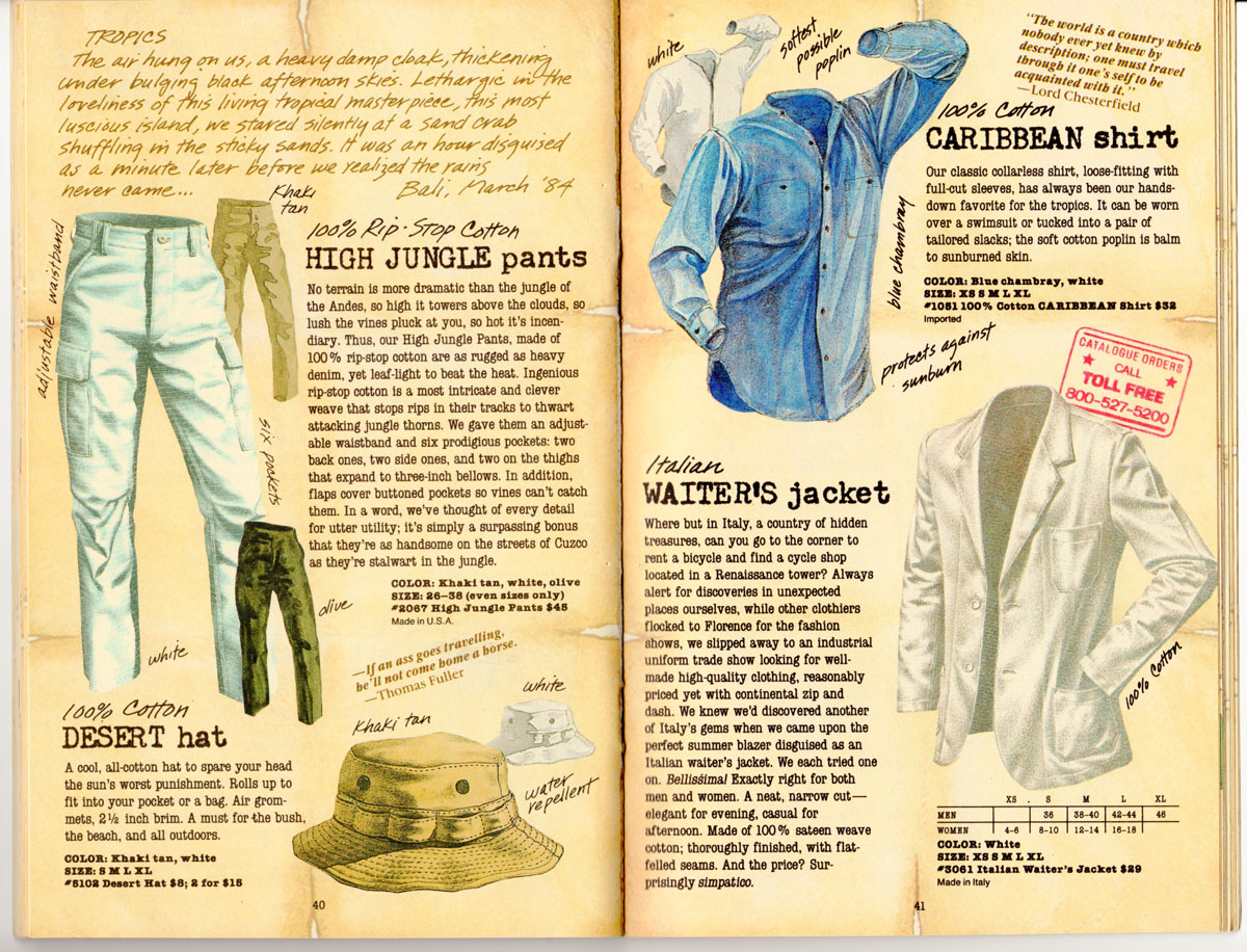
Getting the correct color printed on cream colored paper was always tricky and making a garment look white was a special challenge. Note the blue shadows and highlights on the Jungle pants. The contrast in color temperature helps create the illusion of white.
We printed the catalog on a cream-colored stock, so all of the illustrations had to compensate for that in order for the colors to look accurate in the printed catalog. Patricia was very much into authenticity. We couldn’t print on a white paper stock and then just print a fake cream background around the illustrations. It was especially tricky to try to represent a white garment on cream stock, but we had a lot of tricks up our sleeves.
I would meet other people in the catalog industry who always wanted to know how; what our secret was for getting garments to look white on cream-colored paper.
We’d compensate by putting a lot of blue highlights in the illustration, and doing a lot of cheating in the color separations.
A big part of my job was to go to Atlanta to print the catalog. We were working with a really big printer who specialized in mail order catalogs. The press operators would show you a printed sheet that had eight different pages on it.
Sometimes it wasn’t until one o’clock in the morning that they were ready for you. So I always had to wonder, “Should I have a drink at dinner or am I going to be working tonight?” Or, “Should I go to bed?” And then they call you at 1:00 a.m. and say, “Okay we’re sending a car for you!” I think the first time we went on press, I was up for 72 hours.
They were pretty brutal schedules. You are living at the plant. You’re looking at big sheets of eight pages of catalog. You’re looking at the Bush Vest and it’s too green but the t-shirt down here is too red. If you try to fix the color on one illustration, it affects everything else on that sheet. So you had to make a choice about what was most important.
We had proofs to compare against, but sometimes we actually sent bags of clothes to compare the item to the printed sheet.