Blog

1983 Summer Catalogue

Two versions of the Summer 1983 catalogue. Cover illustration by Kevin Sarkki.

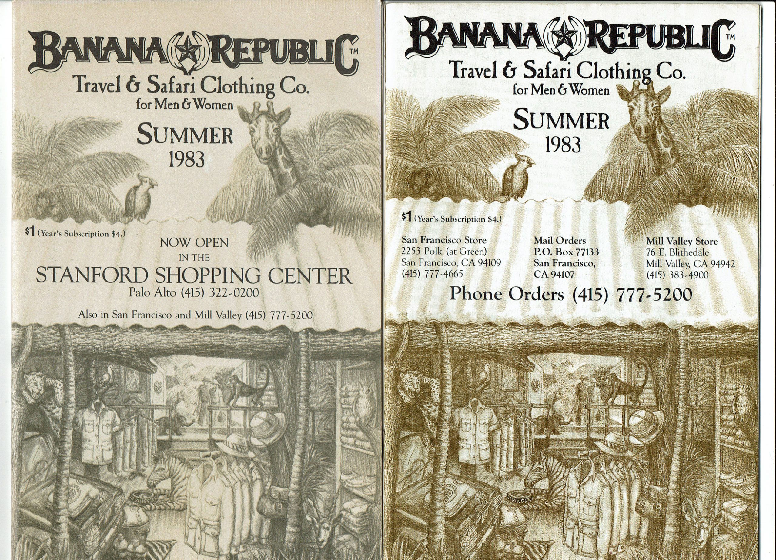
I have the Summer 1983 catalogue in the standard newsprint and also a glossy paper version, the first and only glossy BR catalogue I’ve ever seen. As you can see the newsprint version is announcing the opening of the new Stanford store, so I am left to assume it came out after the glossy which doesn’t mention Stanford.

This cover was drawn by staff artist Kevin Sarkki and he told me he was trying to emulate Patricia Ziegler’s style. It’s a wonderful view of a Banana Republic store with a tin roof awning out front. Inside we see Livingstone the zebra at his food dish, as well as a jaguar, a monkey, an antelope and a bird. To the left is a Jeep piled with BR T-Shirts and on the shelves we see hats and bush jackets and more. In the back there is a mural painted.

I’m fascinated with this cover for another reason: It seems to have been inspired by the artwork created to pitch Banana Republic’s third store! The creation of Stanford store is mentioned at length in the Wild Company memoir . It was the first store the Zieglers opened with a boost from the sale to the GAP. Moving into the prestigious, high-end Stanford Shopping Center was a big step and the center had a long list of draconian standards. When the Zieglers pitched their store they ignored all of those standards and proposed an outlandish concept; What would become the classic Banana Republic Travel & Safari Co store, including the jeep in the window, a life sized giraffe, a neon sign on a tin roof…It was all laid out in this drawing (below) which was originally a color drawing which they copied into sections of foam core to make a 3D mockup of the store. The art helped to sell the Stanford Mall on the concept.

Patricia Ziegler Stanford store mockup

Patricia’s drawing is reproduced in the Wild Company book, be sure to pick up a copy!

This catalog is in a way the missing link between old BR and GAP BR. It’s a transitional piece; It’s the first catalogue with the new logo and logotype designed by San Francisco based designer Primo Angelli who was brought in to elevate the branding. As I describe in the Logos and Tag guide, this version seems a little rougher than the final logo seen in the Fall 1983 catalog, but it’s mostly the familiar design we love.

The catalog opens with an introduction from Mel and Patricia which describes their philosophy and their journey from hunting and selling surplus to finally producing their own goods. The sale to the GAP, completed February 1, 1983, was driven by the need to expand in many directions, and manufacturing their own designs was one of the most pressing needs.

This surplus British Army soap dish was not bought at a Banana Republic, I bought it from a surplus dealer, but it’s the same variety that was sold in several early catalogues. 

It seems to me, however, that they had already started having some things made before the GAP money came in. The Banana Republic Drill Trousers, for instance, are their version of the British Drill Trousers sold alongside each other. These appear as early as mid-1982.

A couple of other things that caught my eye is a BR shirt with the oval logo on the breast pocket and an “Expedition Bag” that looks for all the world like a Brady bag without the leather trimming.

Browse through the entire catalogue below.

About The Author

Robyn Adams
Robyn's fascination with Banana Republic began in 1984 when her Alaskan adventurer father began buying the clothing and giving her the catalogs. She loved the clothes and as an artist she was drawn to the illustrations. She went on to study illustration at art college in BR's hometown of San Francisco and worked for years as a background artist for animation. She is now based in Oakland, CA as a graphic designer and illustrator with Secret Fan Base . She's been collecting and archiving at Abandoned Republic since 2011.

No Comments

Leave a Reply